There’s only one sure-fire way to go about making your ecommerce profits soar. And that’s to listen to the data. Trialling something new on a sub-set of customers while keeping things the same for the rest, allowing you to see the change’s effect.
Randomised trials have underpinned scientific progress for centuries, notably raising medicine from folklore, which could not reliably save lives, to hard science that’s spared millions from an early grave.
So, when a study’s published, it’s worth considering, particularly where it’s a more rigorous study of studies, or ‘meta-analysis’, that could help make money.
Qubit Digital Ltd’s Will Browne and Mike Jones poured over more than 6,700 ecommerce experiments, spanning almost three years, to find what changes made the greatest difference to revenue per visitor (RPV) and we’re here to break down what they found – it’s probably not what you’d expect!
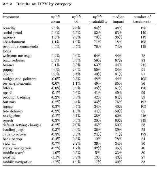
Browne and Jones’ study put specific changes into categories, ranging from websites that respond to the weather in a customer’s location, to offering free delivery or a welcome message. In each case, the RPV was compared between sites that had and hadn’t undergone a change.

Holding true to ‘Sturgeon’s Law’ – that 90% of everything is crud – the study found that 90% of experiments affected less than 1.2% of revenue. Overall, just eight of 29 categories registered a positive impact on average at all and amongst these there was a high degree of variation for most between individual results. In other words, that while they were on the whole a good thing for RPV, some were very bad and others very good – there was no neat clustering around the average. We’ll return to this effect later.
With the picture being of most changes’ unhelpfulness or modest returns, let’s dive into the eight categories shown beneficial on average.
They were:
- Scarcity – highlighting limited stock levels.
- Social proof – highlighting other customers’ activity, increasing the desire to fit in.
- Urgency – stressing customers must complete an action before a deadline.
- Abandonment – attempting to retain customers otherwise showing signs of leaving.
- Product recommendations – displaying products potentially of interest to customers.
- Welcome message – introductory site text.
- Page redesign – substantial changes to sites’ look and feel.
- Banner – alterations to site banners.
The most potent – scarcity, social proof, urgency and abandonment – with average uplift exceeding 1%, all play on customer psychology. The gratification that comes from buying the last item in stock, fitting in with the crowd on the latest fad and beating the clock to seize a deal. All work because they tap into very primal impulses, hardwired into our makeup, that once helped us to survive. Businesses in the ecommerce space would do well to be aware of them and adapt their sites accordingly.
And what did some of the less-than-helpful changes have in common?
These included:
- Colour – modifying site elements’ colour.
- Buttons – changing site buttons.
- Calls to action – making site text more suggestive.
Which are all user interface (UI) changes! The study concedes the possibility that average uplift may have been pulled down by poor UI alterations, but cannot be sure, so stresses choosing a great initial design and sticking with it.
Ambitious site redesigns can work, with some elements more likely to succeed than others – a point underlined by categories’ spread of results, or their standard deviation, which means greater likelihood of making a great popup (2% standard deviation) over a colour tweak (0.4% standard deviation) – but it’s risky. There’s small upside to considerably larger downside.
Delving deeper into ineffective changes yields surprises. Optimising for mobile navigation had the worst effect, confounding conventional wisdom that the platform will come to dominate browsing, and free delivery, superficially a bonus, had a modestly bad affect. But that’s the beauty of science, overturning prior beliefs with a better representation of the truth.
So, that’s our analysis of Browne and Jones’ meta-analysis. Focus on psychology, those ancient forces that drive us, ease up on UI changes, or at least prioritise those with greatest chance of success, and be wary of those demonstrably shown to be bad, such as mobile navigation or site alterations governed by weather.
You only get the time to run randomised trials on your ecommerce customers when you have a back office system in place that enables your business to run smoothly and efficiently. So if you dream of having more time to work on your business, rather than in it, get in touch with us today and request a FREE demonstration of our ERP software.


